Visualising missing data is important when analysing a dataset. I wanted to make a plot of the presence/absence in a dataset. One package, Amelia provides a function to do this, but I don’t like the way it looks. So I made a ggplot version of what it did.
Let’s make a dataset using the awesome wakefield package, and add random missingness.
library(dplyr)
library(wakefield)
df <-
  r_data_frame(
  n = 30,
  id,
  race,
  age,
  sex,
  hour,
  iq,
  height,
  died,
  Scoring = rnorm,
  Smoker = valid
  ) %>%
  r_na(prob=.4)
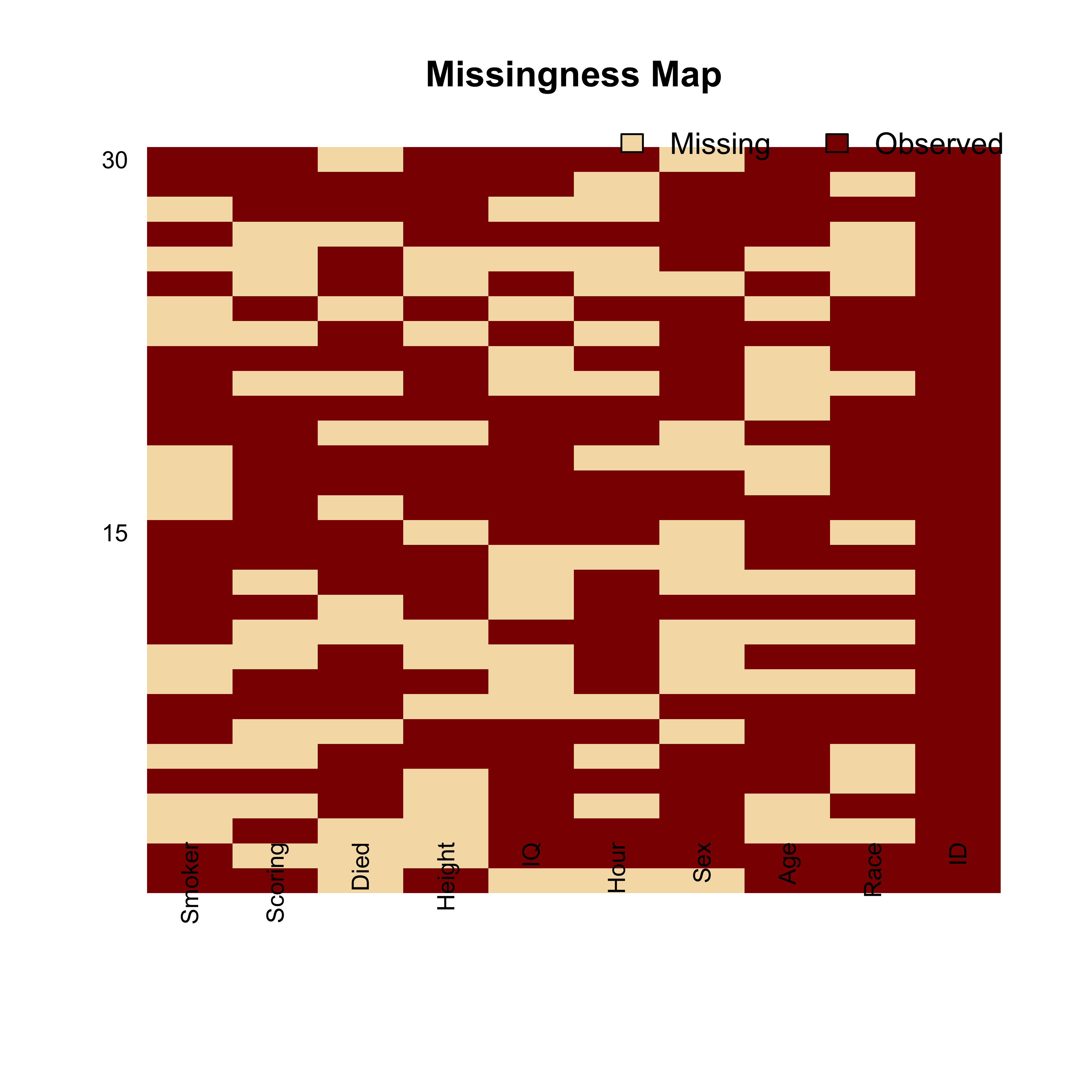
This is what the Amelia package produces by default:
library(Amelia)

missmap(df)
And let’s explore the missing data using my own ggplot function:
# A function that plots missingness
# requires `reshape2`

library(reshape2)
library(ggplot2)

ggplot_missing <- function(x){

  x %>%
    is.na %>%
    melt %>%
    ggplot(data = .,
           aes(x = Var2,
               y = Var1)) +
    geom_raster(aes(fill = value)) +
    scale_fill_grey(name = "",
                    labels = c("Present","Missing")) +
    theme_minimal() +
    theme(axis.text.x  = element_text(angle=45, vjust=0.5)) +
    labs(x = "Variables in Dataset",
         y = "Rows / observations")
}
Let’s test it out
ggplot_missing(df)
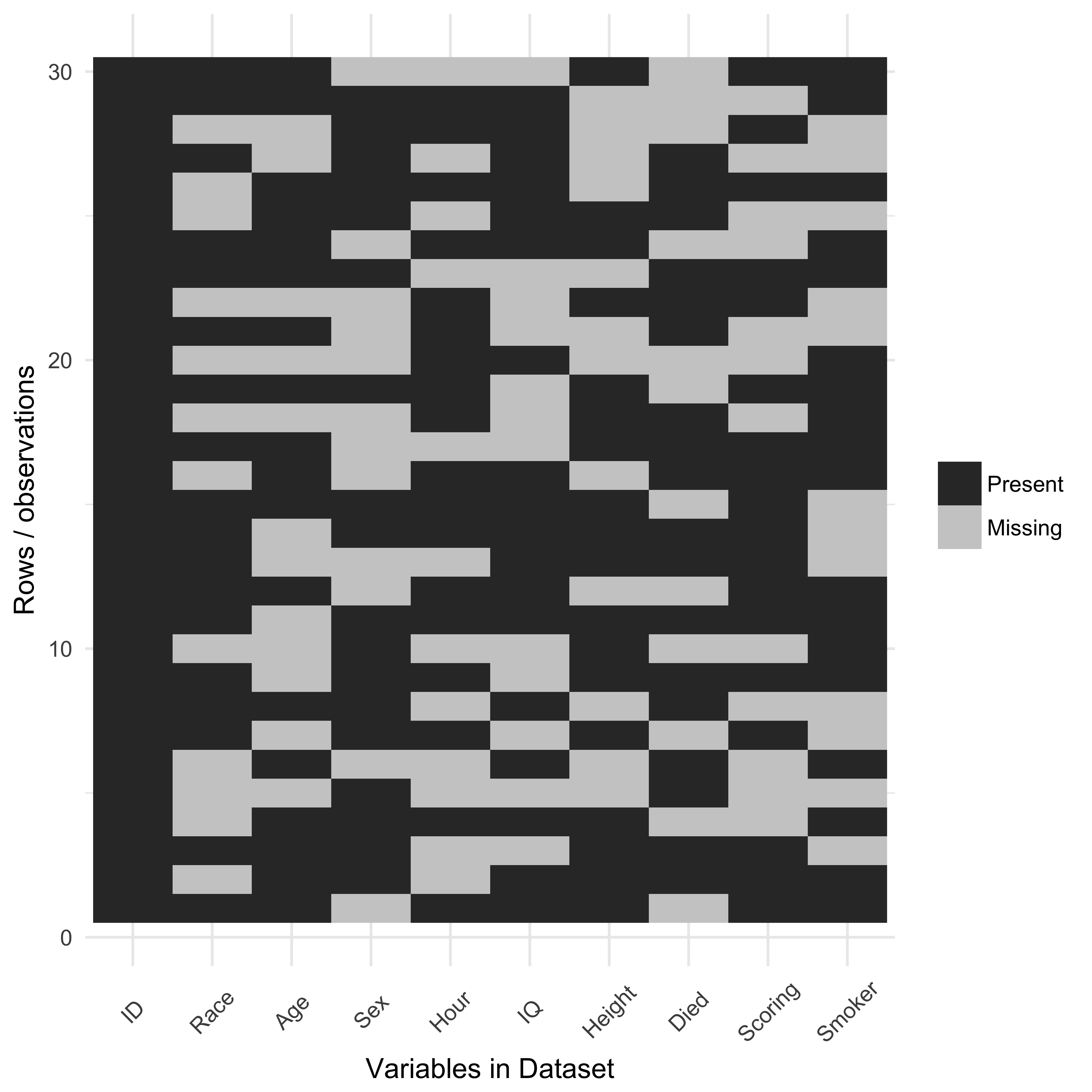
It’s much cleaner, and easier to interpret.
This function, and others, is available in the neato package, where I store a bunch of functions I think are neat.
Quick note - there used to be a function, missing.pattern.plot in the package mi http://www.inside-r.org/packages/cran/mi/docs/missing.pattern.plot. However, it doesn’t appear to exist anymore. This is a shame, as it was a really nifty plot, that clustered the groups of missingness. In the future, maybe I can rebuild what missing.pattern.plot once did. Perhaps in the future I can include this sort of thing in the mex package.
As another aside - if anyone knows how I can improve the image quality of the plots, I’m all ears. I’ve tried changing the dpi, changing it to pdf, png, svg, and even svglite but they all haven’t really solved the problem.
Thoughts? Write them below.